Pantone colour of the year: Emerald 17-5641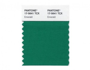
Hello everyone,
Exciting news! Pantone has just announced their colour of the year, Emerald 17-5641. It is described as a lively, lush green, and enhances our sense of well being, by inspiring insight as well as promoting balance and harmony. Emerald is often associated with brilliant gemstones. It is sophisticated and luxurious. Emerald is also the colour of growth, renewal and prosperity; no other colour conveys regeneration more than green.

You can find this colour everywhere from home decor stores, to fashion. This colour may be intimidating for some, but don’t be scared to use it. Adding a few touches of this colour in your home can create a pleasant atmosphere.

Placing some plants in your home is a great way to incorporate this colour. It will also brings the inside out and the outside in (one of my favourite staging tips.) Plants are a great way to make your space feel airy and clean, which we are constantly missing because of our long winter months.

There are a few things to consider when placing the colour green in your home. Green creates feelings of comfort, laziness, relaxation and calmness. It helps us balance and soothe our emotions. Use this colour in bathrooms and bedrooms, as green relaxes our muscles and helps us breathe deeper and slower.


very good and useful information
thanks for keeping us up to date !!